CSS Flex Box Property

Introduction:-
- Flex box is like a blueprint of our website.
- Flex box is a CSS Property that is used to align the elements. Not only that it also help us to create the structure that is needed for a responsive website.
Flex Box Architecture :-
- All the contents are distributed along the main axis and cross axis depending upon the flex-direction, that aligns the items in rows or columns.
1. Flex-Direction :- This is used to give a flow to the items to move in a particular direction.
flex-direction: row:- By default flex-direction is row in CSS property . and in this direction, the main axis is the horizontal axis and the cross axis will be the vertical axis.flex-direction: column:- in this direction the main axis is the vertical axis and the cross axis will be the horizontal axis.Note: There are two more flex-direction which are row-reverse and column-reverse and in these properties, the main axis is the same as in the row and column flex-direction the only difference is that the content will reverse so that if the actual order of items is
1, 2, 3, 4, 5then the order of items will be5, 4, 3, 2, 1.
2. justify-content :- By using this CSS property, we can provide a fixed space between our items and move the items on the main axis. This property work in the main flex container.
justify-content: center:- All the items move on the main axis but it will not provide any space between them.justify-content: flex-start:- All the items start from the starting point of the main axis but it will also not provide any space between them.justify-content: flex-end:- All the items move at the end of the main axis but it will also not provide any space between them.justify-content: space-between:- This provides the same space between all the items.justify-content: space-around:- This provides the same space between all the items but also prove space from starting point to the first element and from the ending point to the last elements.
Note:-justify content property of CSS flex-box is only work on the main axis, so if flex-direction is row then it will work on the horizontal axis and if flex-direction is column then it will move items on the vertical axis.
3. Align-content property :- This property is work as same as justify-content the only difference is that it is work on the cross axis. This property also works in the main flex container.
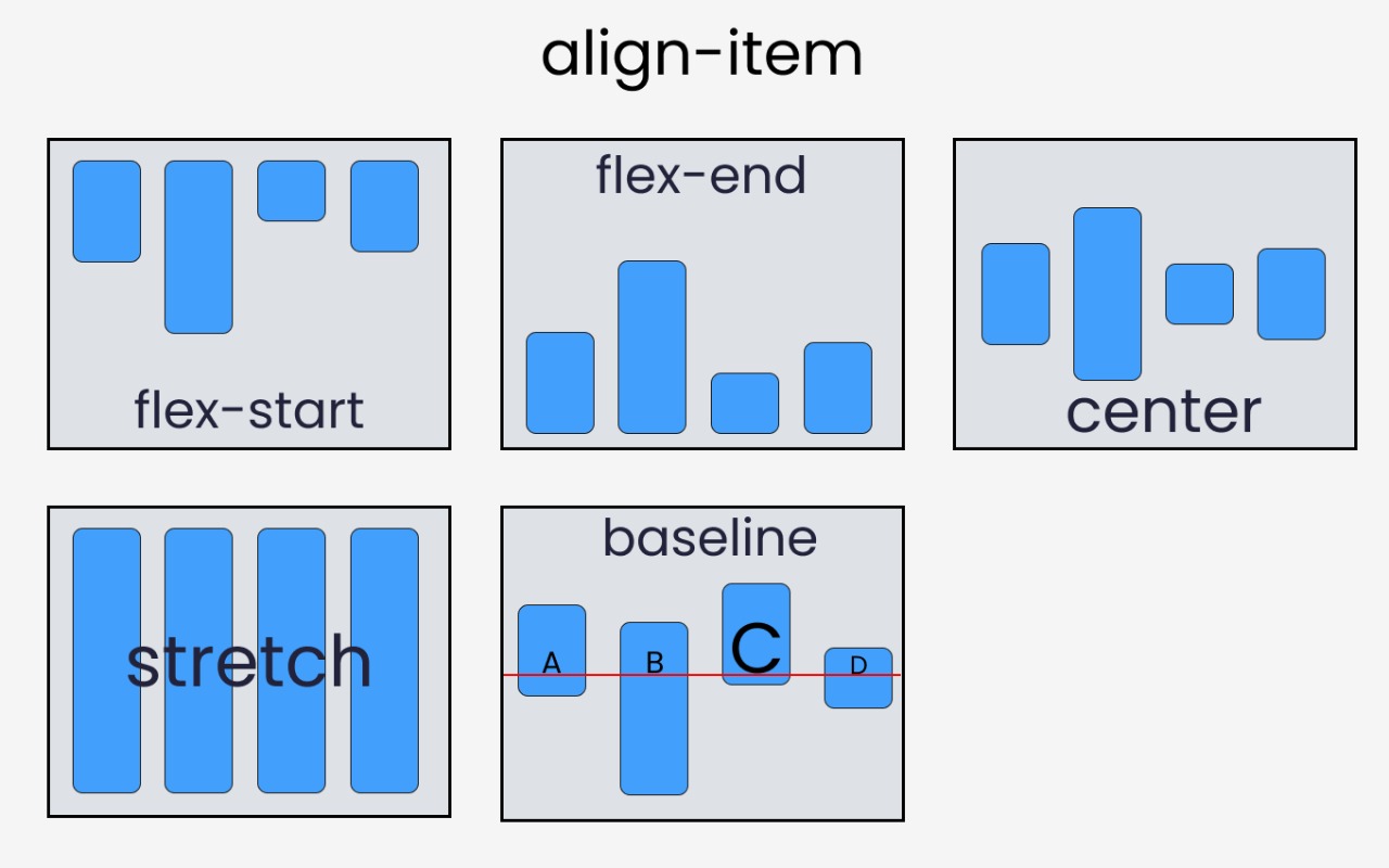
4. Align-item property :- This property distributes flex-items along the Cross Axis. this property is applied on the individual row and it also distributes the items on the cross axis.
- it has a total of five values.
- flex-start
- flex-end
- center
- stretch
- baseline
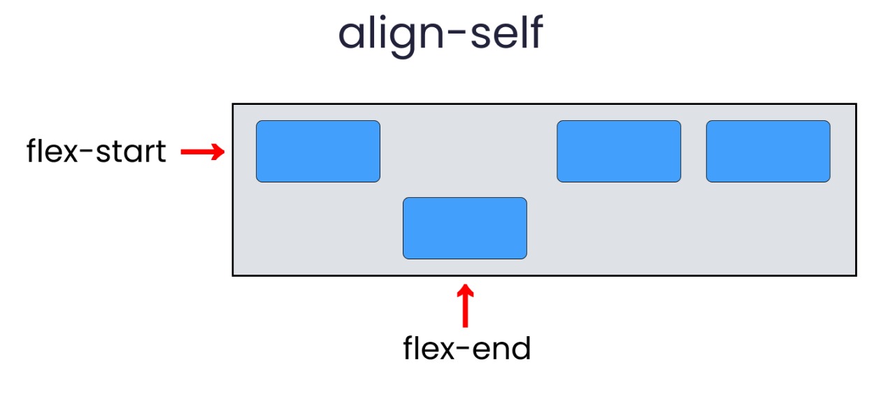
5. align-self property :-This property works on the child classes. It positions the selected item along the Cross Axis.
- it has a total of five values.
- flex-start
- flex-end
- center
- stretch
- baseline
- auto