Tailwind CSS - Getting Started.

Installation :- There are multiple ways of using the tailwind CSS framework in our project.
Tailwind CLI :- This is the simplest and fastest method to work with tailwind CSS.
- Install Tailwind CSS :- Install tailwind CSS with npm, and create a tailwind.config.js file in our local repository.
- Configure template paths :- Add the paths with all the template files in our tailwind.config.js file.
- Add the Tailwind directives to your CSS :- Add the
@tailwinddirectives for each of Tailwind’s layers with the main CSS file.After this process we are to use
tailwind CSSin ourHTMLpage.
The way through which I used Tailwind is by Adding the CDN script to our HTML page. By this method, we don't have to install tailwind and build setup, in this method tailwind directly runs in our browser. But this is not a good method.
Core Concept of Tailwind CSS.
some important Core Concepts are the following:-
1. Utility-First Fundamentals :-This approach allows us to use a completely custom component design without writing a single line of custom CSS.
The font size, text color, and font-weight utilities ( text-xl , text-black , font-medium , etc.) to style the text.
Some of the examples are:-- margin-
m, padding-p, flexbox-flex.
` mx-auto ` - this is treated as margin-auto on the horizontal axis and used to center the aliment on the x-axis.
The width and height utilities
(w-12 and h-12)to size the of and elements.
These all properties are used with HTML, just like inline-CSS.
This approach allows us to implement a completely custom component design without writing a single line of custom CSS.
2. Hover, Focus, and the Other States :-
- Pseudo-classes, like :hover, :focus, and :required.
- Pseudo-elements, like ::before, ::after, ::placeholder, and ::selection.
- Media queries, like responsive breakpoints, dark mode, and prefers-reduced-motion.
Hover, focus, and active effects.
Style elements on hover, focus, and active using the hover, focus, and active modifiers:
3.Responsive Design :- By using different breakpoints we can make our web page responsive. and this is very easy with Tailwind CSS.
Every utility class in Tailwind can be applied conditionally at different breakpoints, which makes it very useful with very less effort to build complex responsive interfaces without ever leaving your HTML.
There are five breakpoints by default, inspired by common device resolutions:
- sm - 640px
- md - 768px
- lg - 1024px
- xl - 1280px
- 2xl - 1536px
The breakpoints name can be anything dependent upon user choice and also the value of the breakpoint can be anything dependent upon need.
4. Flexbox in Tailwind CSS :- There are multiple properties of Flexbox which is used to control the flex items, for example,
(i) Flex Basis:- Utilities for controlling the initial size of flex items.
Use the basis-{size} utilities to set the initial size of flex items.
Note:- size maybe 1, 2, 3, 1/2, 2/3, etc.
(ii) Flex Direction:- Used for controlling the direction of flex items.
flex-direction : row ;- Use
flex-rowto position flex items horizontally.flex-direction : row-reverse ;- Use
flex-row-reverseto position flex items horizontally.flex-direction : column ;- Use
flex-colto position flex items horizontally.flex-direction : column-reverse ;- Use
flex-col-reverseto position flex items horizontally.
(iii) Flex Wrap:- Used for controlling how flex items wrap.
- Don't wrap;- Use
flex-nowrapto prevent flex items from wrapping, it will provide overflow scroll mon x-axis if necessary.
- Wrap normally;- Use
flex-wrapto allow flex items to wrap. -Wrap reversed;- Useflex-wrap-reverseto wrap flex items in the reverse direction.
(iv) Flex Grow:- Used for controlling how flex items Grow.
Don't grow;- Use
grow-0to prevent a flex item from growing:Grow;- Use
growto allow a flex item to grow to fill, the full possible available space.
(v) Flex Shrink:- Used for controlling how flex items shrink.
Don't shrink;- Use
shrink-0to prevent a flex item from shrinking.Shrink;- Use
shrinkto allow a flex item to shrink if needed.
(vi) Flex:- This is the combination of Flex Grow and Flex Shrink. This is used for controlling how flex items both grow and shrink.
Initial;- Use
flex-initialto allow a flex item to shrink but not grow, taking into account its initial size.Flex 1;- Use
flex-1to allow a flex item to grow and shrink as needed, ignoring its initial size.Auto;-Use
flex-autoto allow a flex item to grow and shrink, taking into account its initial size.None;- Use
flex-noneto prevent a flex item from growing or shrinking.
4. Grid in Tailwind CSS :- There are multiple properties of Flexbox which is used to control the grid items, for example,
(i) Grid Template Columns:- Utilities for specifying the columns in a grid layout.
- Specifying the columns in a grid;- Use the
grid-cols-{n}utilities to create grids with n equally sized columns.The value of n maybe 1, 2, 3, 4, etc.
(ii) Grid Column Start / End:- Used for controlling how elements are sized and placed across grid columns.
Spanning columns;- Use the
col-span-{n}utilities to make an element span n columns.The value of n may be 1, 2, 3, 4, etc as per need.
(iii) Grid Template Rows:- Utilities for specifying the rows in a grid layout.
Specifying the rows in a grid;- Use the
grid-row-{n}utilities to create grids with n equally sized columns.The value of n maybe 1, 2, 3, 4, etc.
(iv) Grid Row Start / End:- Used for controlling how elements are sized and placed across grid rows.
- Spanning rows;- Use the
row-span-{n}utilities to make an element span n rows.The value of n may be 1, 2, 3, 4, etc as per need.
(v) Grid Auto Flow:- Utilities for controlling how elements in a grid are auto-placed.
- Controlling grid element placement;- Use the
grid-flow-{keyword}utilities to control how the auto-placement algorithm works for a grid layout.the value of
keywordis something likeflow-row,flow-row-dense,flow-col, etc.
(vi) Justify items :- Used for controlling how grid items are aligned along their inline axis.
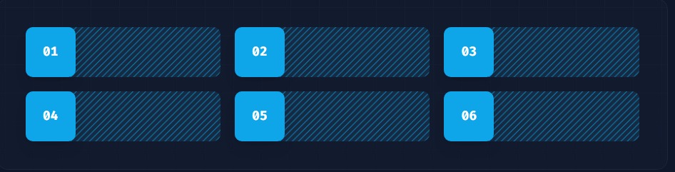
- Start;- Use
justify-items-startto justify grid items against the start of their inline axis.
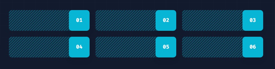
- End;- Use
justify-items-endto justify grid items against the end of their inline axis.
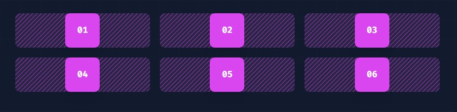
- Center;- Use
justify-items-centerto justify grid items along their inline axis.
NOTE:- there are some common properties that are applicable for both
flexboxandgrid. for example,
(i) Gap :- gap is used for controlling gutters between grid and flexbox items.
Setting the gap between elements;- Use
gap-{size}to change the gap between both rows and columns in the grid and flexbox layouts. This is applied on both axis.Changing row and column gaps independently;- Use
gap-x-{size}andgap-y-{size}to change the gap between rows and columns independently.
The value of
{size}may be1, 2, 3, 4, etcor[1px], [2px],[3px],etcor[1%], [5%], [8%],[10%], etcas per our need.
(ii) Order :- This property is used for controlling the order of flex and grid items.
Ordering flex and grid items;- Use
order-{order}to render flex and grid items in a different order than they appear in the DOM.Using negative values;- To use a negative order value, prefix the class name with a dash to convert it to a negative value
-order-{order}.
The value of
{order}may befirst,last,none, 1, 2, 3, 4, etc.
(iii) Justify Content :- Used for controlling how flex and grid items are positioned along a container's main axis.
Start;- Use
justify-startto justify items against the start of the container’s main axis.Center;- Use
justify-centerto justify items against the center of the container’s main axis.Center;- Use
justify-centerto justify items against the center of the container’s main axis.End;- Use
justify-endto justify items against the end of the container’s main axis.Space between;- Use
justify-betweento justify items along the container’s main axis such that there is an equal amount of space between each item.
Space around;- Use justify-around to justify items along the container’s main axis such that there is an equal amount of space on each side of each item.
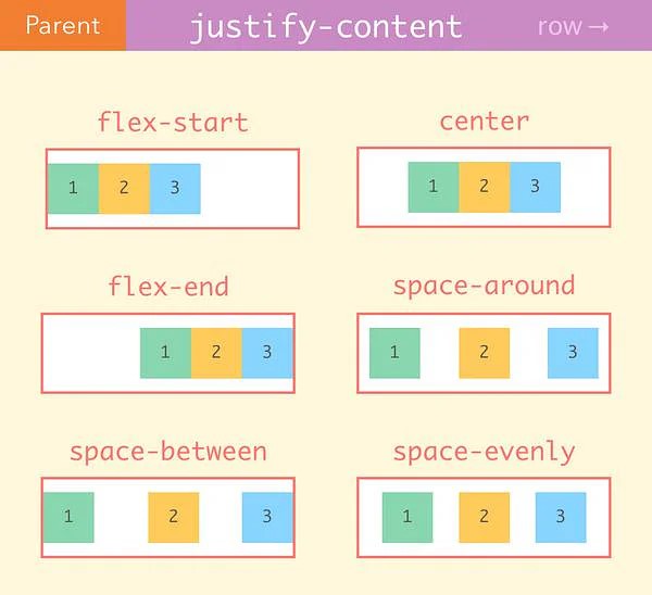
- Space evenly;- This is almost same as
justify-around. Usejustify-evenlyto justify items along the container’s main axis such that there is an equal amount of space around each item.
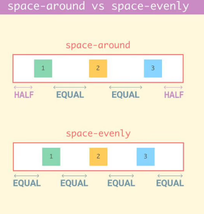
(iv) Align Content :- This property is used for controlling how rows are positioned in multi-row flex and grid containers.
Start;- Usecontent-startto arrange rows in a container at the start of the cross axis.Center;- Usecontent-centerto arrange rows in a container in the center of the cross axis.End;- Usecontent-endto pack rows in a container at the ending of the cross axis.Space betweenUsecontent-betweento distribute rows or elements in a container such that there is an equal amount of space between each line.Space around;- Usecontent-aroundto distribute rows in a container such that there is an equal amount of space around each line in the grid or around each element in the flexbox.Space evenly - Use
content-evenlyto distribute rows in a container such that there is an equal amount of space around each item. This is almost same as thespace aroundproperty.

5.Typography:-
(i) Font Family :- This typography property is used for controlling the font family of an element.
some of the font families are
font-sans,font-serif,font-mono, etc.
(ii) Font Size :- Used for controlling the font size of an element. In tailwind font size is defined as text-{size}.
Some of the font
sizesin tailwind are:- xs, sm, lg, 2xl, 3xl, 4xl, etc.also
sizeis written as [1px], [2px], [1%], [2%],etc.
(iii) Font Style :- used for provide styling to the elements.
The font style available in tailwind CSS is
italicandnot-italic.
(iv) Font Weight:- This property is used for giving thickness to the elements. This property is written as font-value.
Font values available in tailwind CSS are
thin,light,extralight,normal,medium,semibold,bold,extraboldandblack.
(v) Text Decoration:- Utilities for controlling the decoration of text.
Text decoration available in tailwind CSS are
underline,no-underline,overlineandline-through.


